Mold


I've gone from never having read independent culinary publications to two in two weeks! Mold has been my most recent venture and it was such a pleasure.
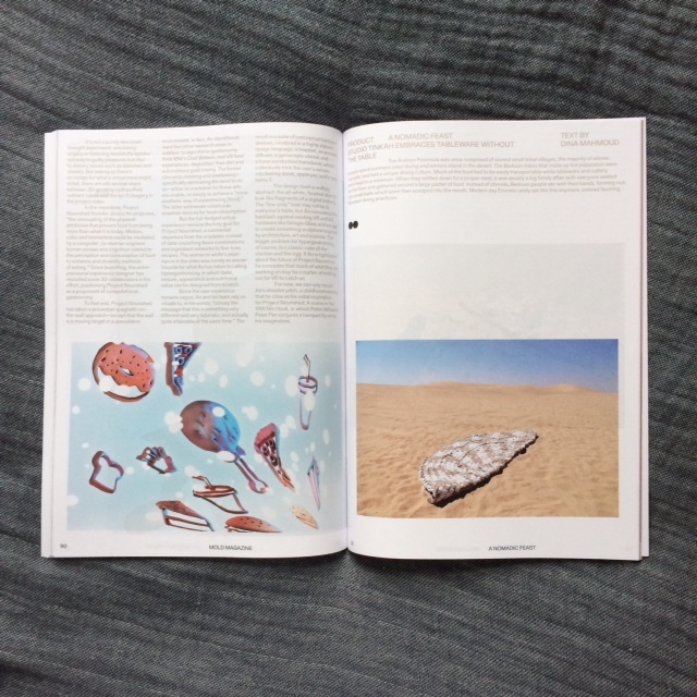
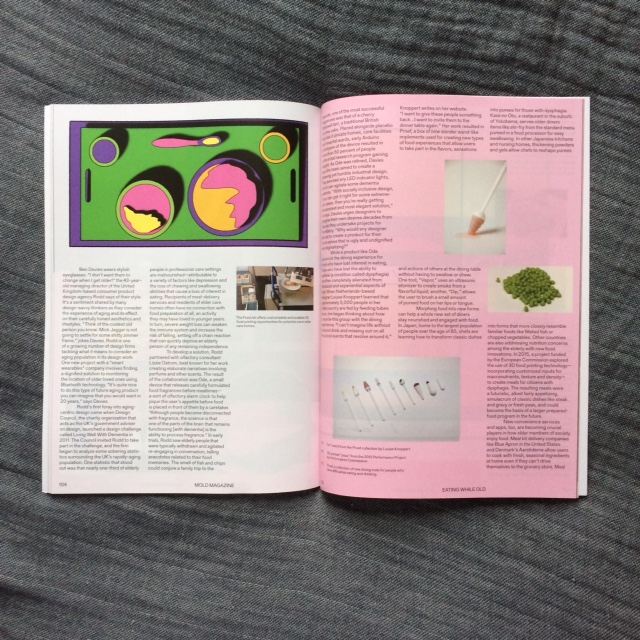
Mold explores the future of food in its current issue which included pieces that explored the design of objects for eating delicacies such as silkworms and termites. Other articles included the favourite chair designs of designers, how the process of eating and nourishment changes for the elderly and what designers can and should be trying to do about it.
Throughout the issue Mold explores how people's experience with food is impacted by the design of objects we eat with and the spaces we eat in.
The content of Mold was fantastic, I loved the alternative approach to a culinary publication. However, I did find that some of the graphic design aspects did take away from the experience. The varying sized typeface for different paragraphs on a page made it hard to decipher where to start and almost implied a hierarchy of information which I don't was the point. I found it distracting and hard to determine what to look at and when. The gold text was eye catching in larger sizing but was hard read at times against a white background.
As it is only in its second issue, I'm sure Mold is still experimenting and determining certian aspects of its identity and what works for them. As I mentioned before, the content of the issue and overall intent of the publication itself is interesting and compelling. I'm excited to see where Mold takes us next.
All images are my own.


